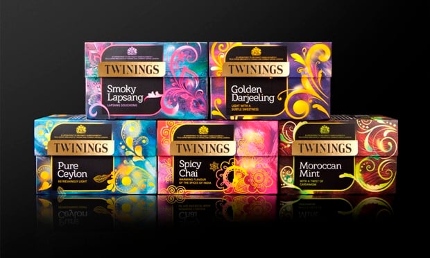
Bar & Restaurant News Bar & Restaurant Expo Vibe Conference World Tea News World Tea Expo Note on World Tea from Questex Advertise Retail Ecommerce Food Service & Hospitality Supply Chain Products & Equipment Innovation World Tea Academy Events Subscribe Subscribe Retail Ecommerce Food Service & Hospitality Supply Chain Products & Equipment Innovation World Tea Academy Events Subscribe Bar & Restaurant News Bar & Restaurant Expo Vibe Conference World Tea News World Tea Expo Note on World Tea from Questex Advertise Features New Design for Twinings Tea Packaging By World Tea News Nov 17, 2014 9:28pm black tea Twinings tea tea packaging Industry Analysis Twinings BrandOpus heir concept pages here Design Week black tea Twinings tea tea packaging Industry Analysis Niche Markets retail Retail Supply Chain Tea Nerdery Features